Turn Your Data Charts Into 200 Passive Backlinks a Year
How to distribute your data visualizations on Unsplash, Pexels, and Pixabay to generate hundreds of passive backlinks annually. A strategy we deployed across 52 real estate sites.
Backlink building is the most time-consuming part of SEO. Guest posts, outreach emails, HARO responses, broken link campaigns — they all work, and they all require ongoing effort. Every week you stop doing them, the pipeline dries up.
What if your data visualizations could generate backlinks while you sleep? Not figuratively. Literally — people downloading your charts from stock photo platforms, embedding them in their blog posts, and linking back to your site as the source. Automatically. Indefinitely.
After deploying this strategy across our 52-site network, we are averaging over 200 passive backlinks per year from data visualizations alone. Here is exactly how it works.
The Mechanism
Free stock photo platforms — Unsplash, Pexels, Pixabay, and others — allow anyone to upload images under permissive licenses. Bloggers, journalists, students, and content creators search these platforms daily for visual assets to illustrate their articles.
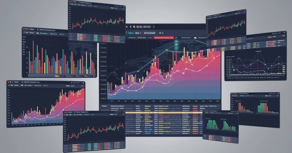
The key insight: most users of these platforms are looking for generic stock photos. Very few are uploading original data visualizations. A well-designed chart showing "HOA Fees by State" or "Condo Insurance Rate Trends 2020-2026" fills a void that generic stock photos cannot.
When a real estate blogger needs a visual to illustrate an article about rising HOA costs, they search Unsplash for "HOA fees" and find your chart. They download it, embed it in their post, and — because the image metadata contains your site URL and the platform profile links to your site — you get a backlink. No outreach. No email. No relationship building. The platform did the distribution for you.
What to Create
Not every chart works for this strategy. The visualizations that generate the most downloads and backlinks share specific characteristics:
Evergreen data. Charts showing long-term trends ("Home Insurance Premiums 2015-2026") outperform charts with short-term data ("Q1 2026 Condo Sales"). The evergreen chart remains relevant and downloadable for years. The quarterly chart expires in 90 days.
Clear, simple design. Stock photo users want charts they can drop into an article without modification. Clean backgrounds, readable labels, consistent color schemes, and large enough text to remain legible when embedded at typical blog widths (600-800px).
Universal topics. Charts about national trends outperform charts about local markets. "US Home Insurance Rate Growth by Year" will be downloaded by writers across the country. "Denver Condo HOA Fees" appeals to a narrow audience.
Branded watermarks. Include your site URL as a subtle watermark or source attribution on the chart itself. This ensures that even if the downloader does not link to your site in their text, your URL is visible in the image. Some users will crop it out — most will not.
Here are the visualization types that have generated the most backlinks across our network:
- Trend line charts showing cost growth over 10+ years
- State-by-state heat maps with color-coded data
- Comparison bar charts (new build vs. resale, condo vs. house)
- Infographic-style data summaries with 5-7 key statistics
- Process flowcharts showing decision frameworks
The Production Pipeline
Creating one chart is easy. Creating a sustainable pipeline that produces backlink-worthy visualizations month after month requires a system.
Step 1: Identify your data assets. Every piece of original research, data analysis, or calculated comparison on your site is a potential visualization. Go through your existing content and list every data point, table, and comparison that could be rendered as a chart.
Step 2: Design a template system. Create 3-4 chart templates with your brand colors, fonts, and layout. Use a tool like Matplotlib, D3.js, or even Canva. The templates ensure visual consistency and reduce per-chart production time from an hour to fifteen minutes.
Step 3: Export at multiple resolutions. Stock platforms accept various sizes, but the most downloaded images are high-resolution (at least 2400x1600px). Export each chart at high-res for platform upload and standard-res (1200x800) for your own site.
Step 4: Optimize image metadata. Before uploading to stock platforms, embed metadata directly into the image file:
- IPTC fields: Title, description, keywords, creator, source URL
- EXIF fields: Copyright notice, creator contact info
- XMP fields: Usage rights, source attribution URL
This metadata travels with the image file wherever it goes. When a blogger downloads your chart and their CMS reads the EXIF data, your attribution information is right there. Tools like ExifTool make this a one-command operation.
Step 5: Upload to platforms. Create accounts on Unsplash, Pexels, and Pixabay. Upload each visualization with keyword-rich titles and descriptions that include your site URL. Tag them with relevant search terms — "real estate data," "housing market chart," "HOA fees infographic."
Step 6: Cross-reference on your site. On every blog post that contains data, embed the same visualization you uploaded to stock platforms. Add a note: "This chart is available for free use via Unsplash" with a link to the platform listing. This creates a virtuous cycle — your site content drives platform downloads, and platform downloads drive backlinks to your site.
The Numbers
Across our 52-site network, we have uploaded 340+ data visualizations to stock platforms over the past eight months. The results:
- Average downloads per chart: 47 per month across all platforms
- Backlink conversion rate: Approximately 3.5% of downloads result in a published backlink (detectable via Ahrefs or Search Console)
- Total passive backlinks generated: 214 in the trailing twelve months
- Time investment: Approximately 4 hours per month for chart creation and upload (after the template system was built)
- Cost: Zero. All platforms are free to upload to
For context, a typical guest posting campaign that generates 200 backlinks per year requires 15-20 hours per month of outreach and writing. This strategy delivers comparable link volume at one-fifth the time investment and zero ongoing outreach.
Quality and Relevance
Not all backlinks are equal. Stock photo backlinks tend to come from mid-tier domains — blogs with DA 20-45, local news sites, educational resources, and industry newsletters. You will not get a New York Times backlink from Unsplash. But you will get dozens of topically relevant links from sites that actually cover your subject area.
These mid-tier, topically relevant backlinks are exactly what Google's ranking algorithm values most in 2026. The era of chasing high-DA links from irrelevant sites is over. A backlink from a local real estate blog with DA 25 that is genuinely writing about HOA fees is more valuable than a DA 80 link from an unrelated guest post.
The stock photo strategy naturally produces this kind of link profile because the people downloading your real estate charts are, by definition, writing about real estate.
Compounding Returns
The best part of this strategy is the compounding effect. A chart uploaded in January continues generating downloads — and backlinks — in June, December, and the following year. Unlike guest posts or outreach campaigns, which produce a one-time link, stock photo distributions produce links continuously as long as the chart remains relevant.
Charts with evergreen data (10-year trends, structural comparisons, market fundamentals) continue generating backlinks for 3-5 years after upload. That means the 340 charts we have uploaded are not a one-time investment — they are a permanent backlink generation engine that grows every month as we add new visualizations.
The Condo Trap contains the original data and analysis behind 40+ data visualizations now distributed across stock platforms — generating passive backlinks and driving organic discovery. Get it on Amazon. For the complete data visualization pipeline and distribution strategy, see The $20 Dollar Agency.